

Trump's Sharpies
Lies, damned lies, and statistics.

When I was an ad copywriter, with a specialty in digital-interactive user experience, I worked on a project where I sat side-by-side at a desktop computer with a gifted data guy, really a software engineer with advanced math skills, and we worked up visual representations of our client’s data—sets of graphs and charts, basically—to tell the story our client wanted to tell, which was about, if I remember correctly, some sort of financial crisis supposedly looming for pharmaceutical benefits managers in state governments.
This would be way back in the very early ‘00’s. I think the dot-com boom was busting even as this particular job was going on.
I wasn’t a gifted data guy with good math. I was an increasingly competent storyteller who had spent the past decade discovering with great interest that I had an unexpectedly productive relationship with the logic, structure, and interactive usability of digitally stored and presented information and was able to connect the nature of that information to the branding, marketing, and business aims of companies trying to “go e-” and “do digital transformation” and “expand into the online channel,” and other such terms then in use regarding commercial development via the public Internet, whose existence still wasn’t fully taken for granted and whose edge still seemed cutting.
Not all copywriters, online or otherwise, have a knack or liking for the tech piece, and often they don’t need to. Yet online is a tech-y business, obviously, so I had a bit of a short-lived niche as one of the “creatives” that programmers tended to grudgingly respect, as I, ungrudgingly, had come to respect them, because I wasn't just writing copy. My job was only then getting its name: “content strategy for the Web.” I thought I invented the practice and found out only later that a lot of other copywriters with similar bents were inventing it too.
My partner on this job wasn’t just a data and software guy but a highly creative person, younger than me (everybody was). We also shared the sense of humor necessary, in that climate, to sanity: the graveyard kind. Hence I guess our being paired on that job, which was an unusually lean operation, a three-person act, just us and a producer who also served as account exec.
Also unusual, for us: the graphs we were building weren’t intended for a website, or if they were, that was secondary. They were to be used primarily in a PowerPoint presentation, which our client’s leading presenter would go around the country presenting at gatherings of those managers. Our job was to use the company’s proprietary statistical research to scare the audience into … I can’t remember what. The looming industry crisis must have been something the company claimed it could address, on a mass scale, before all hell broke loose.
The presenter had his patter down, pat. They didn’t need us for that. The story we were hired to build was to be told in visual representation of the client’s data, each graph another step in a gathering drama narrated by the presenter. The bar graph on the slide that appeared at the climax was supposed to make the audience literally gasp.
So now, when I see Elon Musk and his people describing supposed data points and trends in order to elicit emotional reactions, I know exactly what I’m seeing.
Many people assume that Musk and his team are lying. My experience tells me how they’re lying.
And while it’s shocking that they’re lying at all, shocking that they lie so comprehensively, and with such seeming earnestness, it’s also shocking how crudely they lie—how little thought or effort goes into the deception—because what’s most shocking is their confidence that the audience will believe, and will have the intended reaction, the gasp.
I hasten to assure you that my partner and I on the PowerPoint job did not alter the underlying data, or even present it deceptively (not very, anyway). We did find out quickly that raw data doesn’t always tell the story its owners want it to tell. He would type a bunch of formulas and equations and numbers we’d gotten from the client (gibberish, to me) into, probably, an Excel sheet, click something, and the data would render as a graph. A lot of times, we’d just sit there and stare at it.
Shit.
What the fuck.
That says nothing.
He’d start entering the data in different ways. We’d consider the outcomes and options. What if we rearrange the subsidiary data around a different primary data point? Better. What if we flip the x and y axes? Good! Things start to happen. What’s this doing here? Sometimes you have to add an intermediate slide to create build-up. Combine some data sets, pull others apart. Maybe leave that factor out, see what happens. …
You find you’re telling the story.
Not changing the data. Very deliberately choosing how to present it, for dramatic effect.
It’s like editing video or film.
It’s like writing.
Once in a while, it’s true, the data just flat-out refuses to say what the client wants to tell potential customers it says. In that case, you have to inform the client, and you really don’t want to. They love their data like a miser loves gold; they’ll think you’re the one who doesn’t get it. There was one such incident where, right before a phone meeting in which we were about to have to bite the bullet and say there’s no way, we figured out a solution, and with our producer having already dialed in, we ran into the meeting, late but with a graph that finally did what we wanted it to do. High fives. Kudos from our producer.
We may have distorted reality on that one. If so, I can tell you that a lot of thought, under a lot of pressure, went into how to do it.
I can also tell you that Musk’s Social Security team of crack engineers has done nothing like that.
They’ve carried out no analysis. They’ve made no investigation. They’ve just taken existing information and falsely framed it as having come to light during an investigation, then straight-up lied to the public about what it says.
See for example the video linked under “Further Reading,” below. At 10:35, Aram Moghaddassi, a Musk software engineer, says that 40% of the calls made to Social Security regarding changes in banking information are fraudulent. Bret Baier, the interviewer, repeats the figure—because it really would be surprising—and the engineer earnestly presses the point: “That’s right—almost half.” Musk then takes the ball and starts talking about stolen Social Security numbers and implying (both he and Moghaddassi are careful not to outright state this) that the 40% number represents successful fraud calls, and that diversion of payment is therefore happening on a mass scale, with huge numbers of people not getting their rightful benefits. On Twitter, anyway, many people now believe the manifest absurdity that 40% of the banking-info calls made to Social Security are not only fraudulent but have also been successful in stealing huge amounts of retirees’ money.
The falsehood is derived from the stat. It comes not from an under-the-hood investigation but from Social Security itself, and it refers to a totally different fact: 40% of all fraud attempts come in the form of that kind of call.
You don’t have to be some kind of genius to sort that one out. As I mentioned, I’m no math head. Watching the interview, I sniffed prevarication; in about eight seconds online, I had the real number and saw the nature of the lie. There’s no subtle manipulation—more like simple inversion.
Coming from a software engineer, it can’t an error. And yet look how nicely he delivers it, this highly skilled young man with genuine concerns about improving the system.
Twitter may or may not reflect the degree to which the ploy was broadly successful. The degree of success isn’t the point. The point is that the only intent was to mislead.
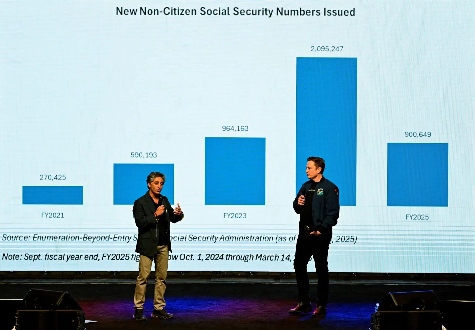
A somewhat more involved concatenation of reality and fantasy was whipped up by Antonio Gracias, a major Tesla investor and sometime director, when collaborating with Musk in presenting that old friend of mine, the gasp-inducing bar graph, to an audience in Wisconsin. (See the other video linked below, at 1:07.) Certain info had “jumped out at” the investigative team, Gracias said, and I bet it did—as potentially inflammatory content, if presented in a misleading enough way.
The inflammation begins with the notion that these numbers had been hidden, and that “good people” at Social Security “took risks,” according to Gracias, in showing them to the Musk team. These are in fact very easy numbers to track, and the graph does show a real and notable rise, 2021-2024, and especially ’24, in the number of what the chart says are non-citizens issued Social Security numbers. Gracias implies—doesn’t quite precisely say—that those issued the numbers are here illegally more or less by definition, because he frames asylum-seeking, which accounts for a major part of the cohort (though he implies it’s the total) a priori as nothing but a dodge for getting around illegal entry. In fact the entire cohort represented on the chart is here legally—that’s why they've been issued the numbers, which are required for employment—but Musk now goes all the way and links the rise during the Biden administration to a supposed plan to import “as many illegals as possible” in order to “change the entire voting map of the United States.”
And so in the fantasy that emerges, non-citizens who have been issued Social Security numbers are here illegally (they’re not); the cohort shouldn’t have Social Security numbers at all (non-citizens are required to have them in order to work); and as a kicker, that the Social Security numbers enable them to register to vote illegally (they don’t).
Gracias and Musk really stir the crowd up with that last claim regarding voting. They present no evidence for it, graphic or otherwise, and they mingle the assertion with the supposedly shocking fact that some in the cohort are getting Medicaid benefits (they don’t note that it’s only those actually granted asylum). They don’t even say how many people in the group are supposedly registered to vote. Musk’s implication, naturally, is that it’s an apocalyptic number, leading to the end of Western civilization itself, but he and Gracias would have to show data well beyond these five goofy trend bars to make even one of the many conclusions they’re drawing even remotely credible.
That they don’t show any such data is revealing in itself.
But they don’t have to. They can draw the all-important audience-gasp—the entire goal of the exercise—without hardly trying.
At first, I and other skeptics believed that Gracias’s insult to the public’s intelligence in presenting this data was at least as crude as Moghaddassi’s. An alternative graph went around social media, restoring the years 2017-2020 to the chart and seeming to show that the number of non-citizens issued Social Security numbers during Trump’s presidency was about as high as it was during Biden’s and went down in 2020 because immigration fell way off during the pandemic.
But simply whacking off the left half of a graph to concoct a false trend might have been almost unbelievably lame. The deception, it turns out, is not quite that simple. On Twitter, Gracias clarified that, unlike in the expanded chart put around by skeptics, which tracks all immigrants, his data tracks only the immigrant cohort called Enumeration Beyond Entry (EBE)— people automatically issued Social Security numbers.
His clarification is indeed clarifying. But what he inadvertently clarified is the trick’s actual mechanics.
For one thing, Gracias’s more comprehensive graph shows that the automatic issuing of Social Security numbers to this cohort, whose expansion he and Musk framed in the presentation as a Biden plot, was an innovation that began in 2019, under Trump. But what Gracias doesn’t reveal to his followers is even more startling. Social Security numbers are issued automatically to EBE immigrants because the EBE program is limited to a) noncitizens granted work authorizations and b) newly naturalized U.S. citizens.
So not only is the whole group here legally, contra Gracias and Musk (which we already knew): some of them are citizens. And the whole graph is falsely labeled “Non-Citizens,” since EBE includes citizens.
That really is just as crude a trick as the 40% hustle. Just mis-title the graph!
The reality of EBE also means that Musk and Gracias didn’t have to be lying when they said that some members of the group have voted, since new U.S. citizens are in the group.
And since expanding EBE to new citizens occured in ‘24, the abrupt increase in the number that year is neither surprising nor sinister.
In any event, the graph’s mis-titling would only be the cherry on top of what's already an amazing load of bullshit, as in Gracias’s clarification, which concludes, “I think these facts speak for themselves. As the son of legal immigrants to America, I am an ardent supporter of legal immigration.” Again as if the numbers refer to people here illegally.
You can argue about U.S. asylum and naturalization policy. A lot of people found Biden’s asylum bans draconian. I don’t know what the policy should be, but all of that’s beside the point. This isn't about policy. The entire aim of the pseudo-investigation and the misleading presentation of data is to arouse public fear and loathing by creating false impressions.
These people Musk brought into government were once engineers and entrepreneurs. They gave that up. To become crisis actors.
Back in 2019, when President Trump wanted Hurricane Dorian to have taken the path he’d incorrectly predicted it would take, he used a Sharpie to draw a new path on a weather map and pretended it was real (he also got the National Oceanic and Atmospheric Administration to retract its statement about the real path). This is the same sort of stuff, lying so childish that it should be apparent to anyone possessed of any skepticism at all. (When Gracias tells the audience “This is not political,” you can hear the politics vibrating in his throat.) But unlike Trump and the hurricane, this is not weird and petty stuff, and the lying is not delivered with Trump’s patented irascible, dithering, victimized looniness. There’s a new rationality of tone, a performance of data-geekery, totally at odds with the catastrophic intent.
Trump lies because that's how he thinks. The effect can be disastrous, but it's unfocused, scattershot. These people do Sharpie-level lying for dire and concentrated purposes.
________
Further Reading
Musk and team:
Gracias and Musk:
The real 40% stat (updated since I first saw it).
As a former data scientist and software engineer, the only way you would know that a call was fraudulent is if you flagged it as such. Yes 40% means it's an attack vector but WHAT IT REALLY MEANS IS THAT YOU ARE GOOD AT DETECTING FRAUD!
Good article.
You say:
“… it’s also shocking how crudely they lie—how little thought or effort goes into the deception—because what’s most shocking is their confidence that the audience will believe, and will have the intended reaction. “
Perhaps but I wonder if there has been research done on “Big lie theory”. My guess would be “Keep it simple. Say it with confidence and authority. Have one thing to give the lie an air of objectivity. Pretend like it is self evident.”
People are entering politics with only training on how to be deceived. That is the nature of capitalist parliamentarianism.
Lies are easy. The truth, objective, scientific truth, is hard to achieve in every possible meaning of the terms. It is made harder when there are significant material interests at stake and they are fighting against it.
However the turn by the U.S. ruling class to support Trump’s dictatorship shows that they know the old lies and propaganda have ceased to work and the new lies must be backed up by force, violence and terror.
Why did Hitler and the Nazis need a vicious and violence dictatorship? Because they needed to crush that anti-fascist sentiment among German workers by force. The tragedy of Germany 1933 is that the social democrats and Stalinist communist party passively acquiesced to their own destruction. The trade unions were worse; they tried work with the new government before its leaders were all arrested on 2 May 1933, they day after Hitler and Hindenburg had attended massive union marches for the new “National Day of Labour”. They should have seen it coming (Mussolini’s government had become a dictatorship in October 1926) but wishful thinking dies hard in human affairs.
History must be studied and lessons learned.